A Restored 316 Theme for Kadence
Inside Travelogues
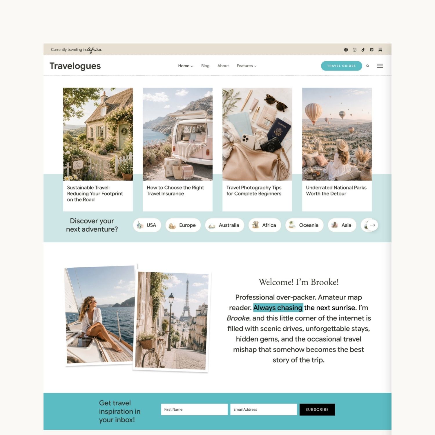
A travel-blogging theme built for storytellers. Four homepage designs, a shelf of interactive touches, and a settings panel that lets you switch any of it on or off — without touching a line of code.
Choose Your Look
Four Homepage Designs
Every homepage is built with Kadence blocks, so you can rearrange, restyle, or borrow sections from one layout and drop them into another.
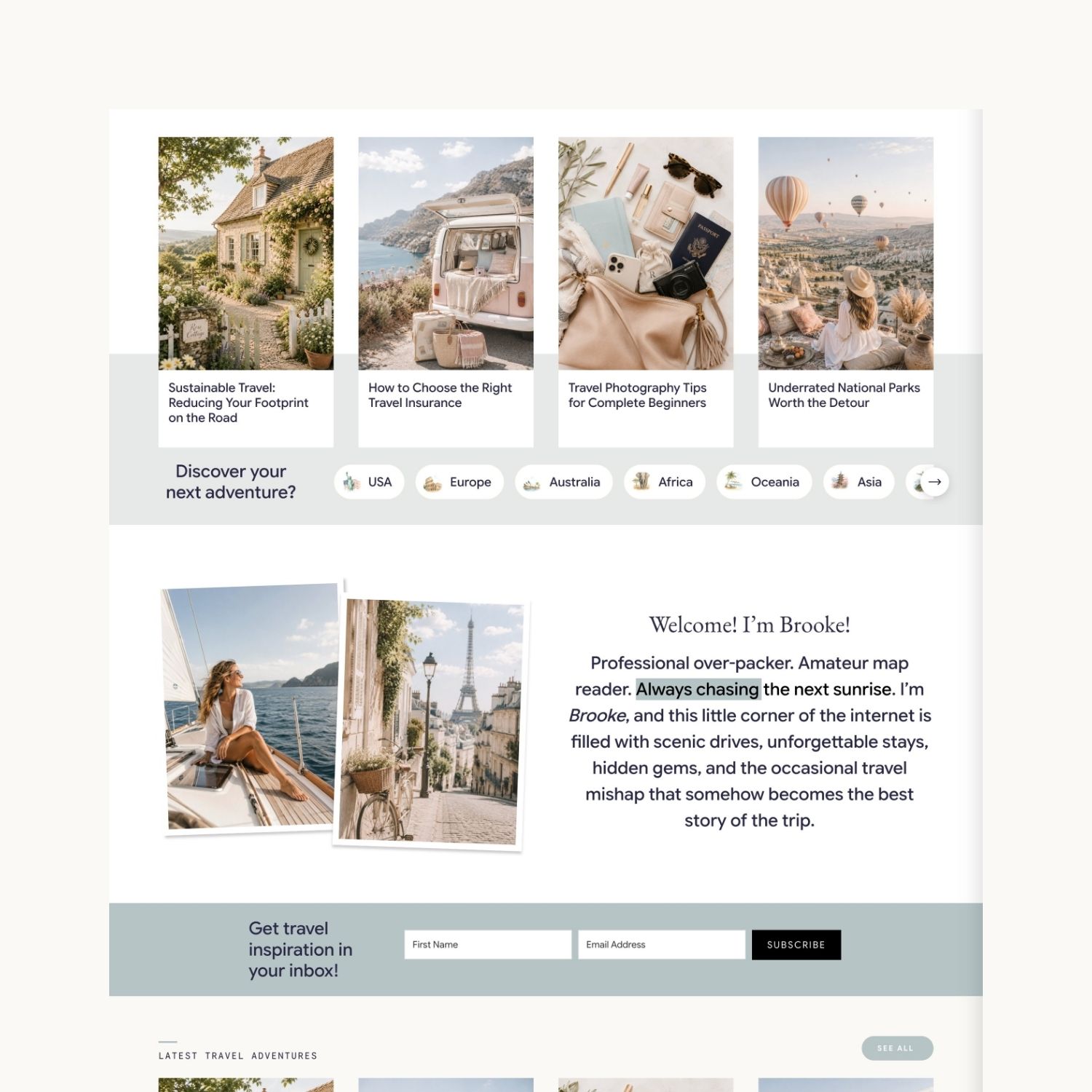
Home One
A warm welcome up top, then destination guides and itineraries, a freebie sign-up, and a closing invitation. The most straightforward of the four.
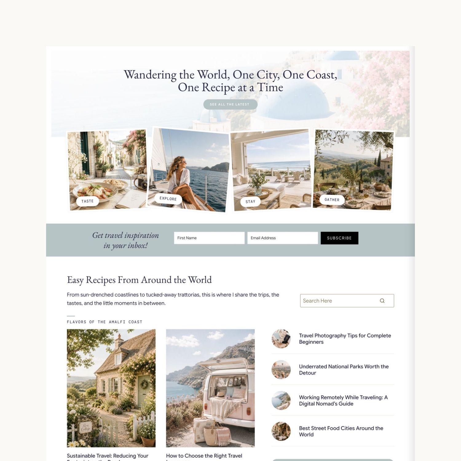
Home Two
The fullest layout — a sweeping opening statement, recipes, destination guides, places to stay, a planning-guide download, and a 30-day challenge.
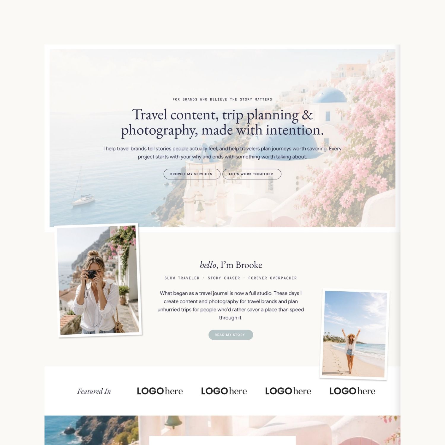
Home Three
Leads with what you do rather than where you’ve been: an intentions statement, a services section, testimonials, and a clear call to work with you.
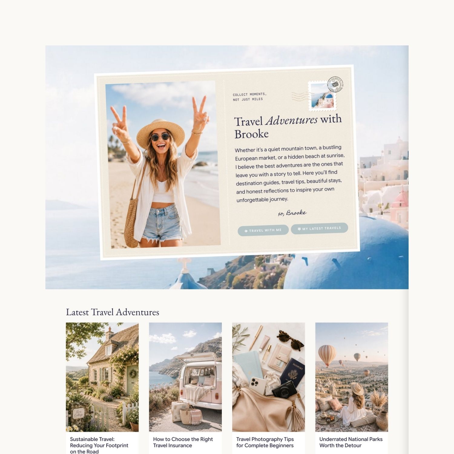
Home Four
Built around browsing. Latest adventures up front, then scrollable category rows — road trips, solo trips, beaches, Europe — plus the eraser-reveal feature.
You’re In Control
Your Settings Panel
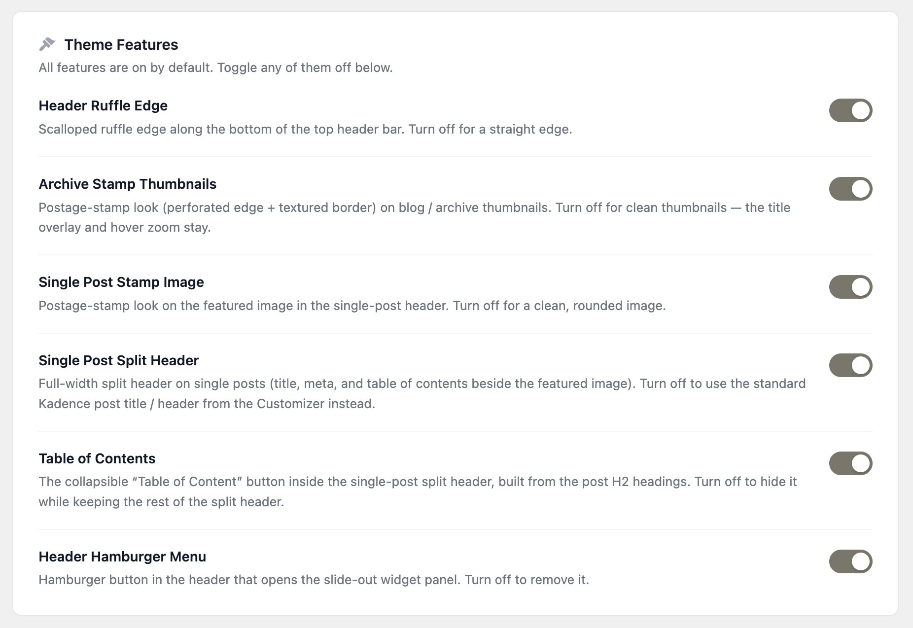
Travelogues adds its own settings page to your WordPress menu. Every custom feature has a switch — flip one off and the theme quietly falls back to a clean, standard layout. Nothing breaks, and you can change your mind any time.
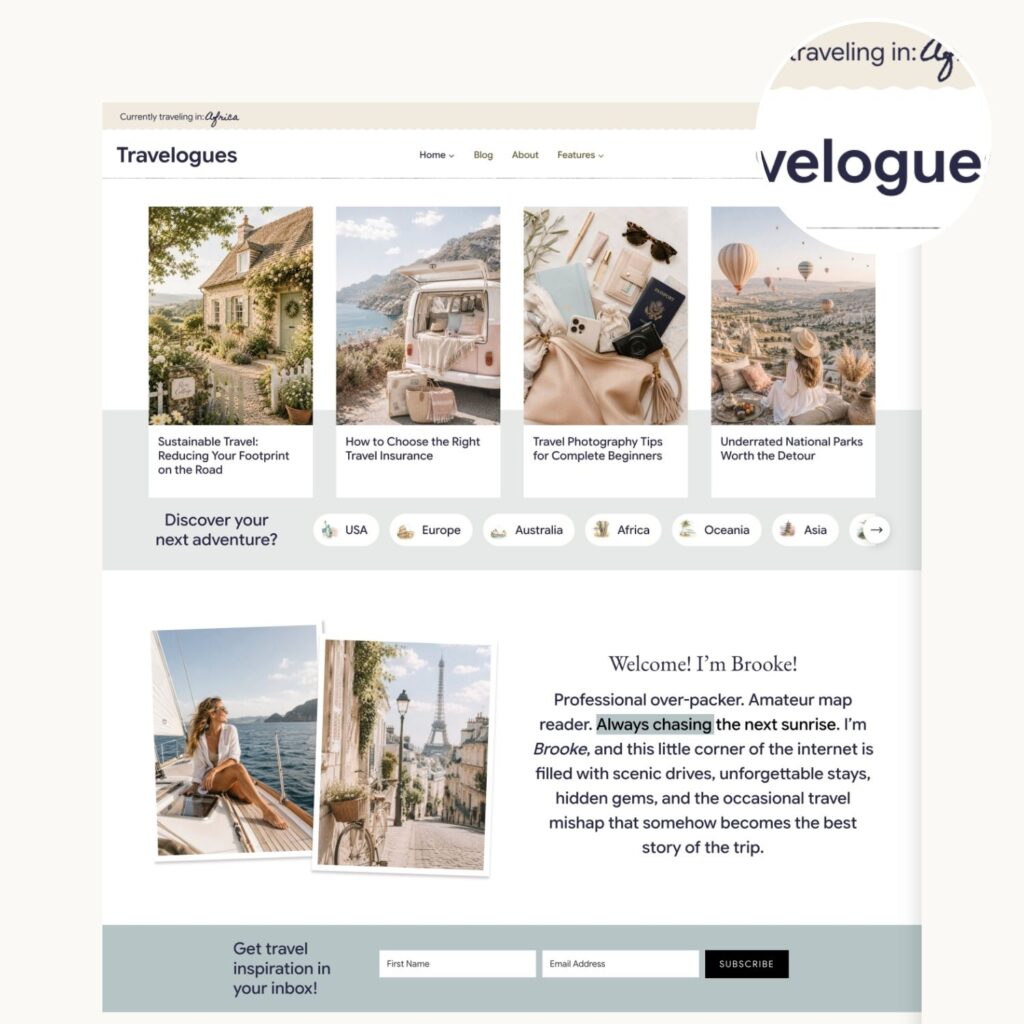
Header Ruffle Edge
A scalloped ruffle along the bottom of your top header bar. Switch it off for a crisp straight edge.
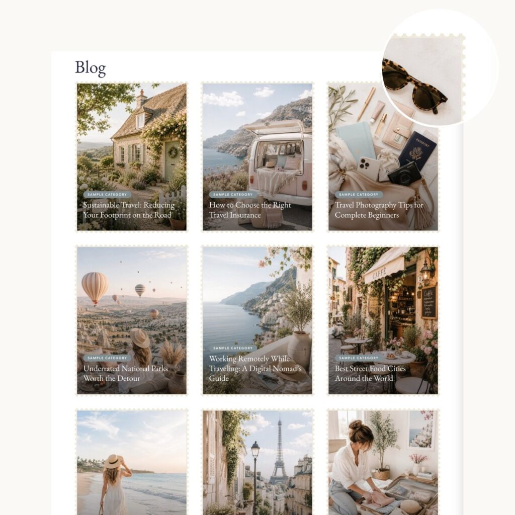
Archive Stamp Thumbnails
Turns your blog thumbnails into postage stamps, with perforated edges and a paper texture. Off gives clean thumbnails — you keep the title overlay and hover zoom either way.
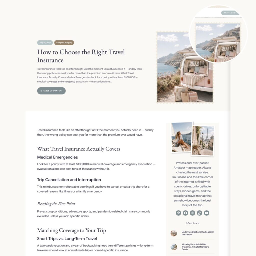
Single Post Stamp Image
The same postage-stamp treatment on the featured image at the top of each post. Off gives you a soft rounded image instead.
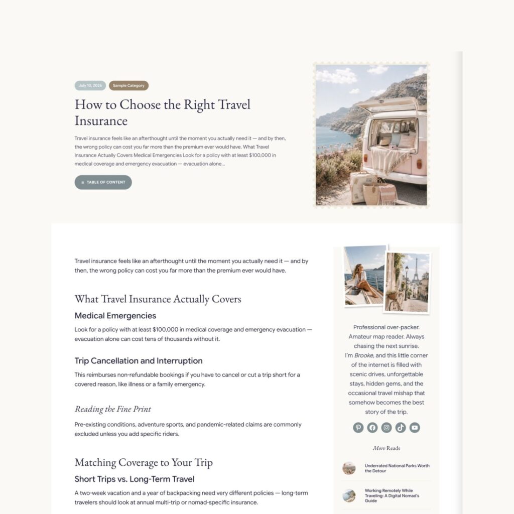
Single Post Split Header
A full-width header on your posts, with the title and details beside the featured image. Off uses Kadence’s standard post header.
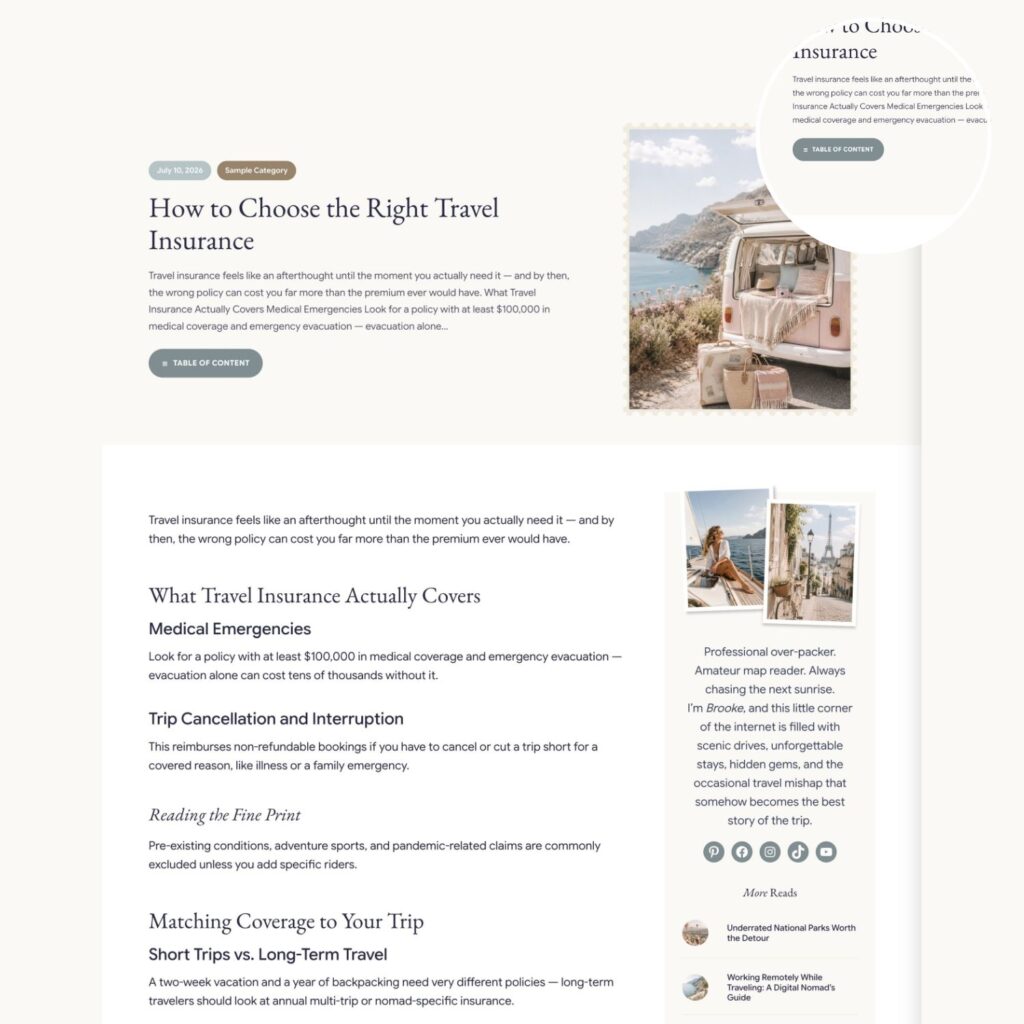
Table of Contents
A tidy contents button on long posts that builds itself from your headings — no plugin, no manual list, nothing to maintain.
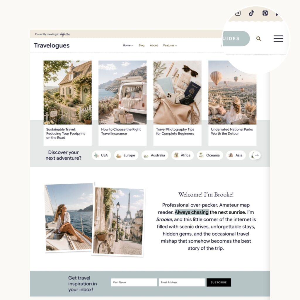
Header Hamburger Menu
A hamburger button in your header that opens a slide-out panel you can fill with anything — a mini menu, a photo, a sign-up form.
Built In, Ready To Use
Interactive Touches
The small moments that make a site feel considered. Each one is already set up on the demo, so you can see exactly how it works before you use it — and every one adapts sensibly on a phone.
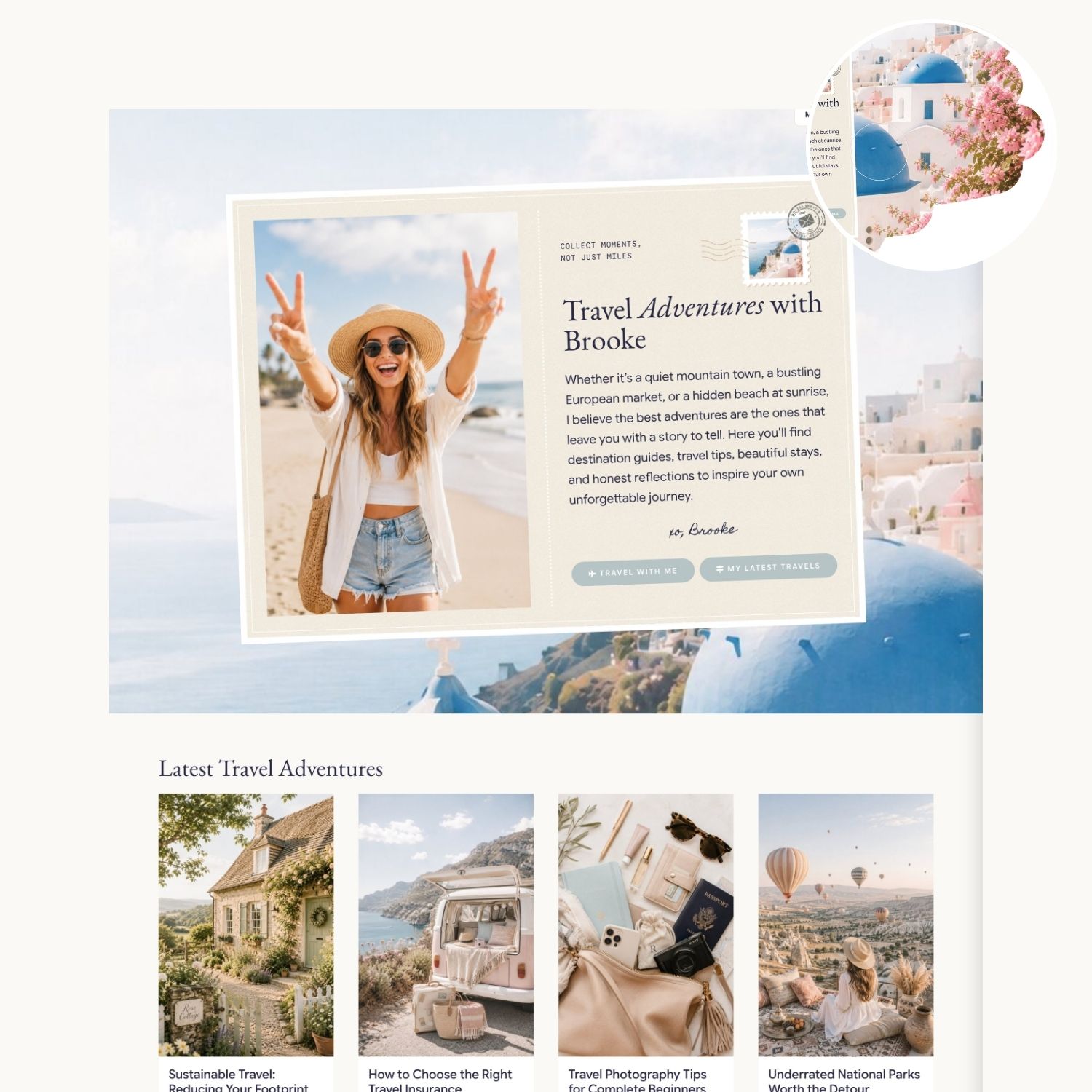
Eraser Reveal
Visitors sweep their cursor across the section and the colour wipes away like frost on a window, uncovering the photograph underneath. Buttons and links stay clickable throughout.
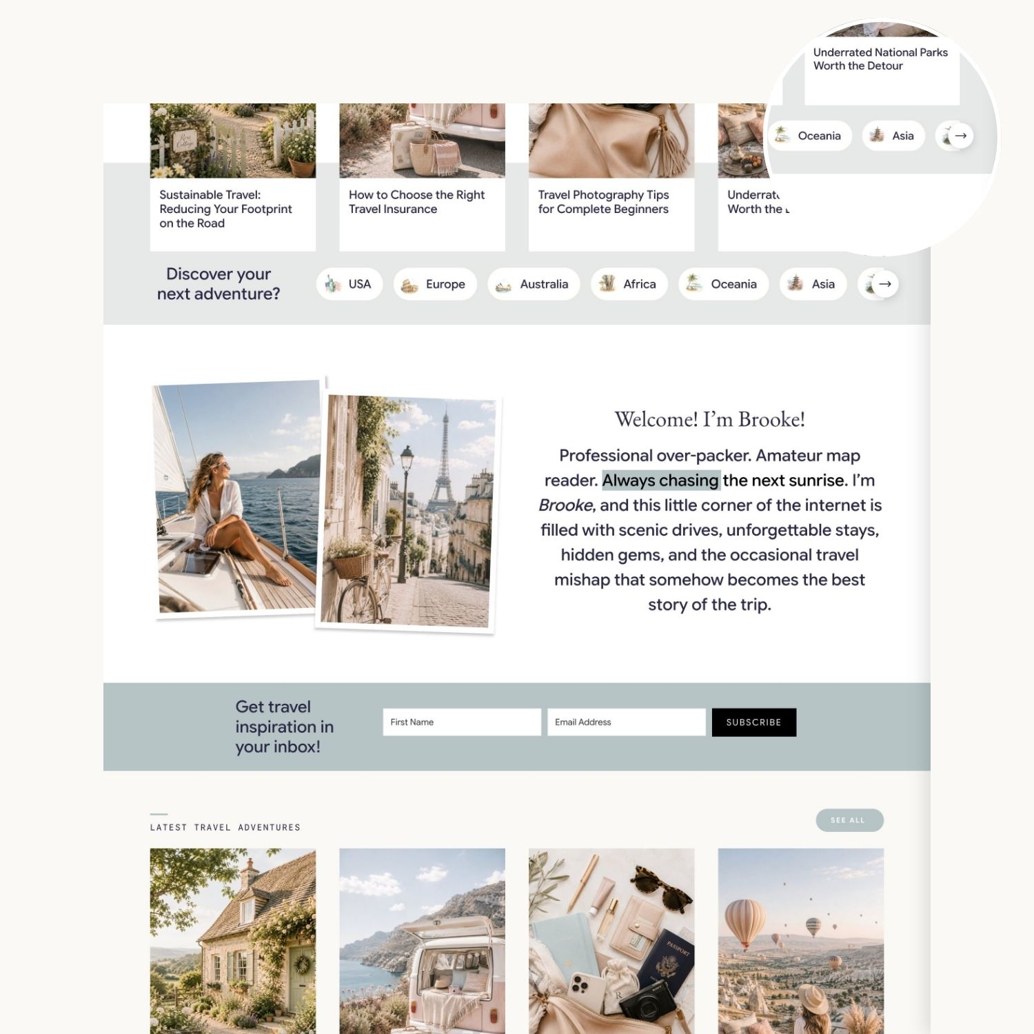
Scrolling Category Rows
Browse categories in a horizontal row with arrows that appear only when there’s more to see — a neat way to surface a lot of posts in a little space.
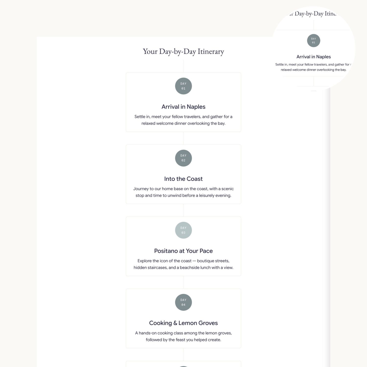
Itinerary Days
Lay out a trip day by day, and the day your reader is looking at lights up while the rest step back. Ideal for guides, itineraries, and multi-part plans.
Three Ways To Wear It
Color Schemes
Three palettes ready to go. Choose the one that suits your photography and apply it across the whole site — or use them as a starting point and make the colours your own.
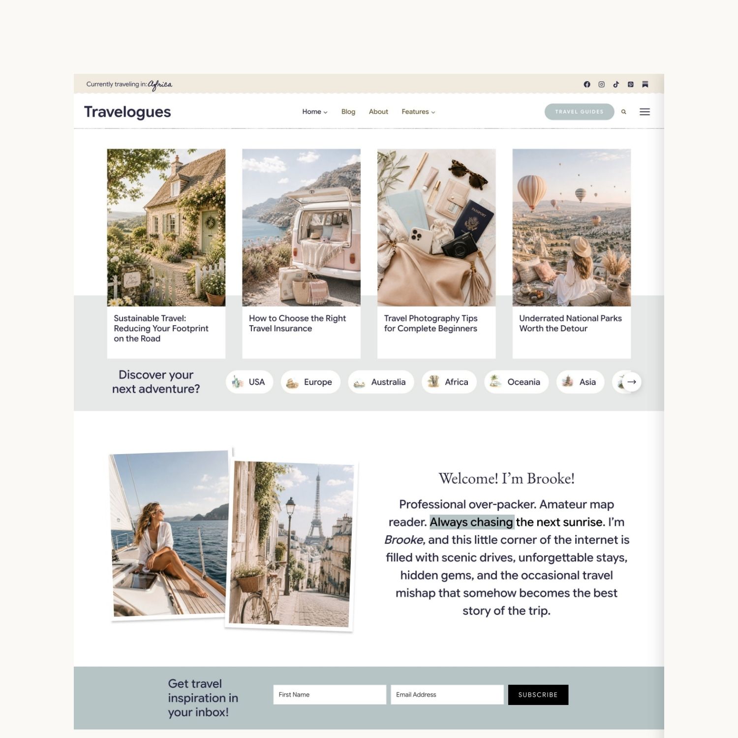
Scheme One
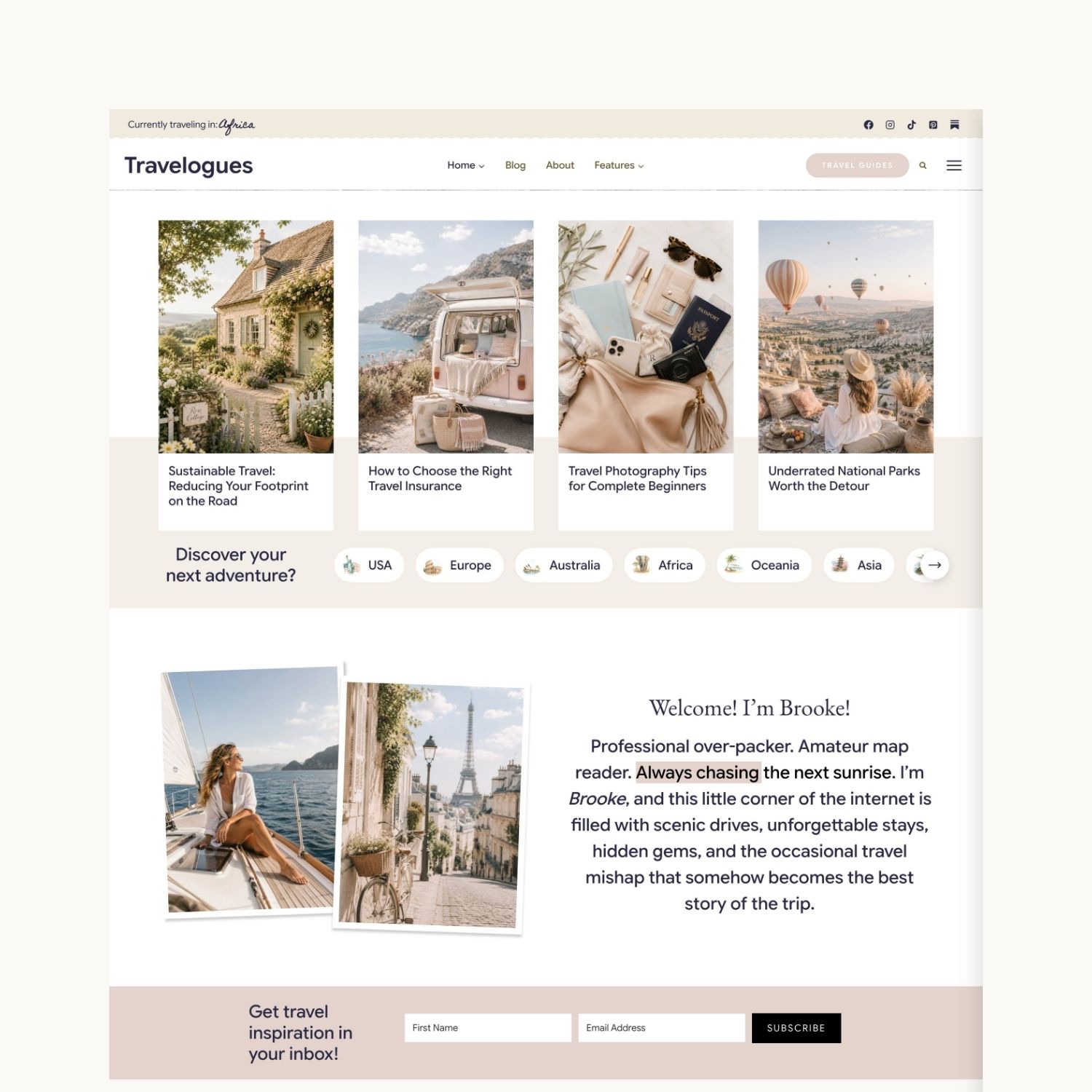
Scheme Two
Scheme Three
Everything In The Box
What Comes With It
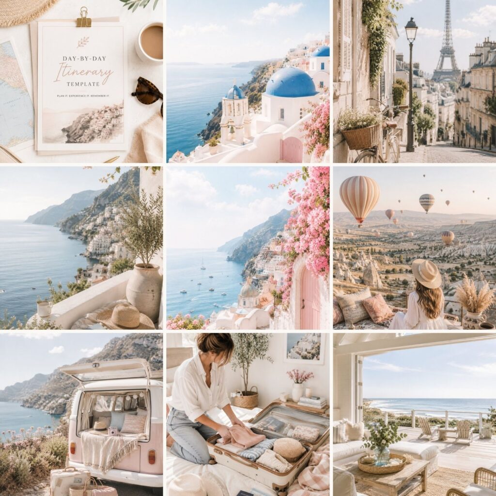
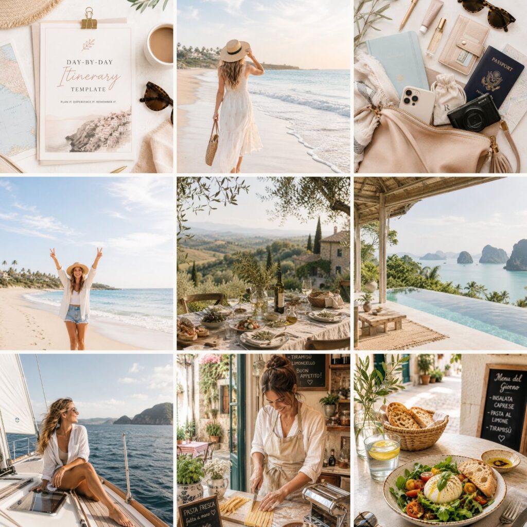
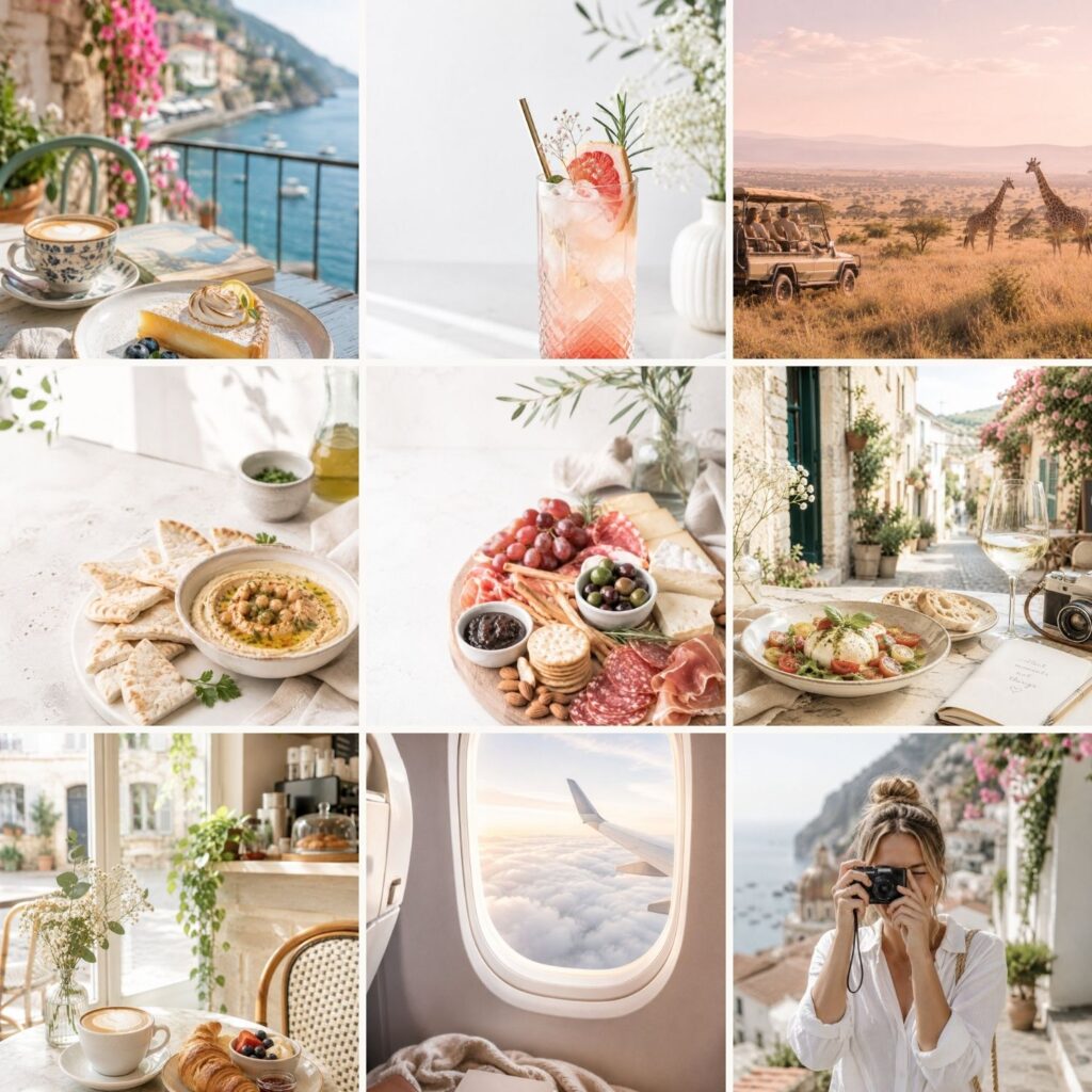
Every demo image
All the photography you see on the demo site comes with the theme, so your site looks like the demo from the moment you install it — no stock-photo hunt before you launch.
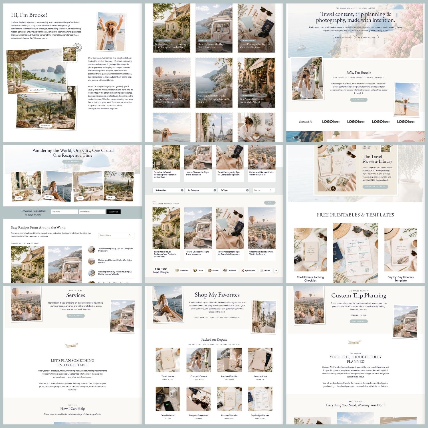
Ready-made page layouts
Beyond the homepages — About, Services, Destinations, Recipe Index, Start Here, Links, opt-in and trip pages, all built and waiting for your words.
Canva extras file
A Canva file with the graphics created for the theme, so you can edit them in your own colours and carry the look through to your social posts, freebies, and lead magnets.